


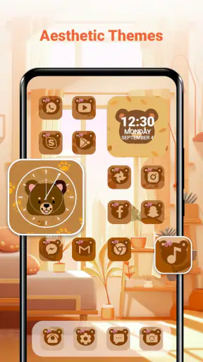
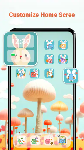
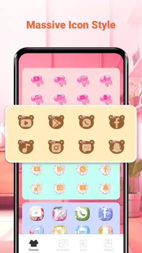
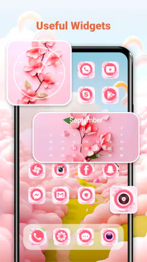
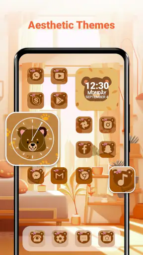
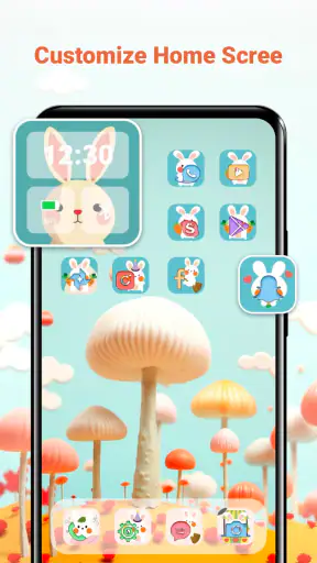
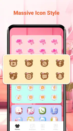
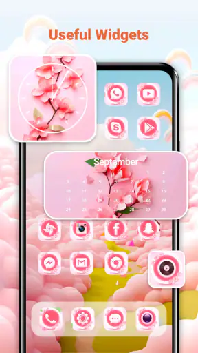
When a phone is used by more than one person in a household, personalization becomes less simple than choosing a pretty background. One person may want a calm home screen, another may prefer bright icons, and a child may change everything without realizing that the layout was helping someone find important apps. I tested Themes-Wallpaper&Icons&Widgets with that shared-device situation in mind, and I found it most useful as a visual customization tool rather than as a complete household-management solution.
The app comes from Innova Tool and focuses on the parts of Android that people notice first: wallpaper, icons, themes, and widgets. It is free to install, with optional purchases ranging from $1.99 to $39.99 per item. That makes it easy to try without committing immediately, although anyone planning to explore many premium-looking options should pay attention to which choices require payment.
My overall impression is mixed in a useful way. The app can make a familiar phone feel noticeably fresher, especially when the default launcher looks dull or inconsistent. At the same time, customization adds decisions, and those decisions matter more when a device is shared. A design that looks great to one person can make the phone less comfortable for somebody else.
How it works in a shared household
A practical scenario before changing anything
Imagine a family tablet or an older phone kept in the kitchen, living room, or car. One person uses it for messages and calendars, another checks recipes or music, and a younger user opens games and videos. On a personal phone, I would usually choose a theme based only on my taste. On a shared device, I would first ask which apps must remain easy to recognize and whether the new design makes the home screen clearer or merely more decorative.
The strongest use case for this app is giving that device a neutral visual refresh. A restrained wallpaper, familiar icon shapes, and one readable widget can make the screen feel organized without turning it into a personal statement. I would avoid a highly stylized theme on a device that several people depend on, because unusual icon artwork can slow down the person who did not choose it.
For a private phone, the app is more liberating. I can accept a little visual inconsistency if the result matches my taste. For a household phone, I treat the home screen almost like a shared noticeboard: attractive, but immediately understandable. That difference is important, and it is one reason I would not install every available element at once.
The first setup deserves a slow approach
I recommend starting with the wallpaper alone. It is the least disruptive change and gives a quick sense of whether the app’s visual style suits the device. After that, I would adjust icons and widgets separately rather than applying everything in one step. This makes it easier to identify which change improved the screen and which one made it harder to use.
That step-by-step workflow is especially useful when another household member is nearby. Instead of presenting a completely unfamiliar screen, you can ask whether the main apps are still recognizable after each adjustment. It also avoids the common customization mistake of choosing a theme because its preview looks impressive, then discovering that the practical home screen feels crowded.
I would keep the first page reserved for the apps everyone needs. Less important shortcuts can stay on later pages, where they do not compete with communication, navigation, school, work, or emergency tools. A widget should earn its space by providing information that people actually check. If it only fills an empty area, it may make the layout look finished while making the important icons harder to find.
Boundaries matter more than visual variety
The app is categorized for personalization, so I see it as a layer over the phone’s appearance, not a replacement for the device’s user accounts, privacy settings, parental tools, or app permissions. That distinction is crucial in a shared setting. Changing the look of a screen does not create separate spaces for different people, and it does not prevent one user from seeing or opening content that belongs to another.
If the device contains private messages, work material, payment apps, or personal photographs, I would handle those concerns through the operating system’s own account and security features before experimenting with themes. The customization app should come after those boundaries are in place, not instead of them.
I would also agree on a simple household rule: do not change the shared home screen without telling the other regular users. This sounds obvious, but visual changes can affect routine. Someone who relies on an icon’s position may interpret a redesign as a missing app. A short conversation before applying a new theme prevents a surprising amount of frustration.
Keeping recognition intact
One of the less obvious trade-offs is that a theme can improve consistency while reducing recognition. If every icon follows a matching style, the screen may look cleaner, but the familiar visual cues that help people identify an app quickly can become less distinct. That matters for children, older relatives, guests, and anyone who uses the device only occasionally.
My approach is to preserve the position of essential apps even when changing their appearance. I would also avoid placing several similar-looking shortcuts together. For a shared device, location is often more reliable than artwork: the messaging app stays in the same place, the camera remains easy to reach, and settings are not hidden among decorative choices.
This is also where the app compares differently with the usual alternatives. A built-in wallpaper picker is generally simpler and less disruptive, while a launcher with deeper controls may offer more precise layout management. Themes-Wallpaper&Icons&Widgets is appealing when I want several visual elements considered together, but I would choose the phone’s native tools when stability and familiarity matter more than a coordinated appearance.
Coordinating choices without overcomplicating them
For a household, I would create a small decision process rather than letting everyone browse endlessly. First choose the mood: quiet, colorful, dark, playful, or minimal. Then decide which elements are allowed to change. A family might agree on a new wallpaper but keep the existing icons, or choose new icons while leaving the widget area untouched.
This approach has another advantage: it makes disagreements manageable. If one person dislikes the icon style, the whole experiment does not need to be abandoned. You can return to the previous element and keep the part that worked. I found this more practical than treating a theme as an all-or-nothing package.
For a shared tablet used by children and adults, I would ask the younger users to choose between a few suitable options rather than handing over the entire design process. That gives them a sense of participation while keeping the screen usable for everyone. It is not a parental-control feature, and it should not be treated as one; it is simply a sensible way to coordinate a shared visual space.
Age context and trust
The app carries an Everyone content rating, which makes it approachable for general household use. Still, an age label is not the same as a guarantee that every design choice will suit every person. Children may focus on bright artwork, while adults may care more about readability and quick access. I would supervise the first setup on a shared child-accessible device, particularly when optional purchases are available.
The purchase range is worth discussing before anyone else uses the phone. Because the app is free to start but includes individual in-app items, I would make sure the device’s normal purchase protections are active and that children know they must ask before selecting anything that costs money. This is not a criticism of personalization itself; it is basic housekeeping for any shared device.
Trust also includes knowing who is responsible for restoring the layout. If several people can change the appearance, one person should know how to return the screen to a familiar arrangement. I would take a quick screenshot of the agreed home screen before experimenting. That simple reference is more useful than relying on memory after several icons and widgets have been moved.
What I would watch during everyday use
After setup, I would use the phone normally for a day rather than judging the result immediately. The first impression is usually about color and style. The second impression comes from repeated actions: opening messages, finding the camera, checking the calendar, or handing the phone to someone who has not seen the redesign.
Pay attention to small friction points. Does the wallpaper reduce contrast behind text? Do redesigned icons make two apps look too similar? Does a widget push useful shortcuts below the fold? Does a family member hesitate before opening an app they previously recognized instantly? These are signs that the visual upgrade has become a usability downgrade.
I would also check the screen after rotating the device or moving between home pages, where relevant to the phone’s normal behavior. The goal is not to test every possible combination, but to notice whether the chosen design remains comfortable outside the preview. A theme that looks balanced in a selection screen may feel busy once notifications, folders, and everyday shortcuts are present.
Who will enjoy it most
I think the app suits people who want more than a single background but do not want to build a complete visual system manually. It is particularly attractive for someone whose phone feels stale, whose default icons do not match, or who enjoys changing the mood of a device with the seasons or personal interests.
It also works well for a private secondary phone where experimentation is welcome. An older spare device can feel less disposable after a thoughtful visual refresh, and a themed layout can make it easier to give that phone a specific purpose, such as reading, music, travel, or household coordination.
I would be more cautious about recommending it to someone who values the stock Android appearance, dislikes changing routines, or needs every icon to remain exactly as familiar as possible. I would also skip it as the main solution for a shared device with sensitive information, because appearance alone does not separate people or protect accounts.
Performance expectations and version context
The app supports Android 7.0 and later, so it can be relevant for devices that are not running the newest software. That broad compatibility is helpful when a household keeps an older phone in circulation, although the final experience can still depend on the device’s launcher and system behavior.
The current version is 2.10.0. I would install it with realistic expectations: a personalization app can change the visual layer, but it cannot make older hardware feel faster or replace a launcher that has become unreliable. If the phone already struggles with basic navigation, I would solve that first and only then decide whether extra visual elements are worthwhile.
The app’s average rating is 3.6 from around 2.4 thousand ratings, while it has passed one million installs. I read that combination as a sign to keep expectations balanced. There is clear interest in the concept, but it is not the kind of tool I would recommend blindly to every Android user. The right result depends heavily on how much control the phone’s existing setup allows and how carefully the user chooses the visual elements.
My household verdict
After using Themes-Wallpaper&Icons&Widgets, I see it as a convenient way to refresh a phone’s appearance, especially when I want wallpaper, icons, and widgets to feel related instead of selected independently. The free starting point lowers the barrier to trying it, and the app makes sense for personal devices where the owner can make decisions without negotiating every change.
For a shared household device, my recommendation is more specific: use it conservatively. Start with the wallpaper, protect the location of essential apps, introduce one widget at a time, and agree on who can change the layout. Keep account security and age-appropriate access in the operating system’s own tools. Visual personalization should support shared use, not pretend to replace privacy or household boundaries.
I would recommend the app to a friend who wants a more coordinated Android screen and is comfortable checking the cost of optional items before choosing them. I would not recommend it as a must-have for someone who wants the simplest possible setup or needs separate spaces for different users. Used with that distinction in mind, it is a worthwhile free experiment: attractive when handled deliberately, but best judged by whether the phone becomes easier to live with after the novelty wears off.


